Python中scatter函数参数及用法详解
发布于 2018-02-13 12:58:49 | 283 次阅读 | 评论: 0 | 来源: 网友投递
Python编程语言
Python 是一种面向对象、解释型计算机程序设计语言,由Guido van Rossum于1989年底发明,第一个公开发行版发行于1991年。Python语法简洁而清晰,具有丰富和强大的类库。它常被昵称为胶水语言,它能够把用其他语言制作的各种模块(尤其是C/C++)很轻松地联结在一起。
这篇文章主要介绍了Python中scatter函数参数及用法详解,小编觉得挺不错的,现在分享给大家,也给大家做个参考。一起跟随小编过来看看吧
最近开始学习Python编程,遇到scatter函数,感觉里面的参数不知道什么意思于是查资料,最后总结如下:
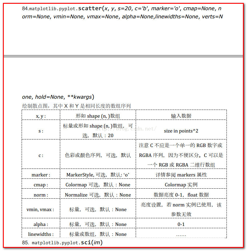
1、scatter函数原型
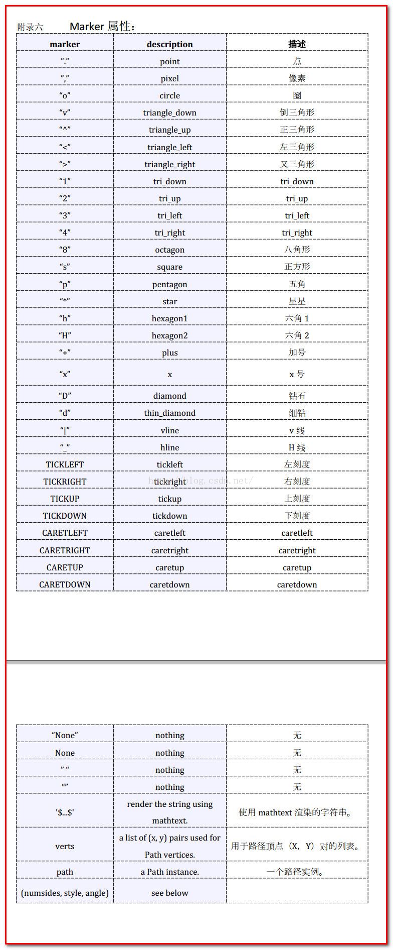
2、其中散点的形状参数marker如下:
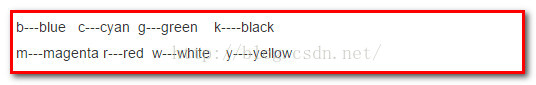
3、其中颜色参数c如下:
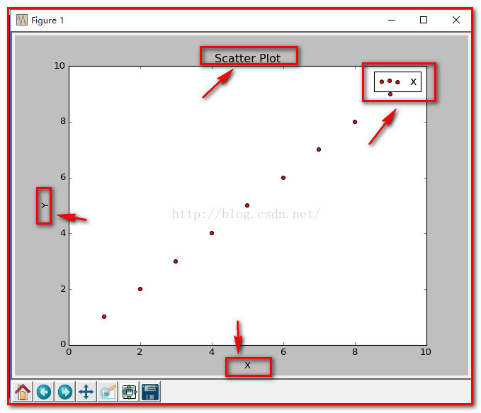
4、基本的使用方法如下:
#导入必要的模块
import numpy as np
import matplotlib.pyplot as plt
#产生测试数据
x = np.arange(1,10)
y = x
fig = plt.figure()
ax1 = fig.add_subplot(111)
#设置标题
ax1.set_title('Scatter Plot')
#设置X轴标签
plt.xlabel('X')
#设置Y轴标签
plt.ylabel('Y')
#画散点图
ax1.scatter(x,y,c = 'r',marker = 'o')
#设置图标
plt.legend('x1')
#显示所画的图
plt.show()
结果如下:
5、当scatter后面参数中数组的使用方法,如s,当s是同x大小的数组,表示x中的每个点对应s中一个大小,其他如c,等用法一样,如下:
(1)、不同大小
#导入必要的模块
import numpy as np
import matplotlib.pyplot as plt
#产生测试数据
x = np.arange(1,10)
y = x
fig = plt.figure()
ax1 = fig.add_subplot(111)
#设置标题
ax1.set_title('Scatter Plot')
#设置X轴标签
plt.xlabel('X')
#设置Y轴标签
plt.ylabel('Y')
#画散点图
sValue = x*10
ax1.scatter(x,y,s=sValue,c='r',marker='x')
#设置图标
plt.legend('x1')
#显示所画的图
plt.show() 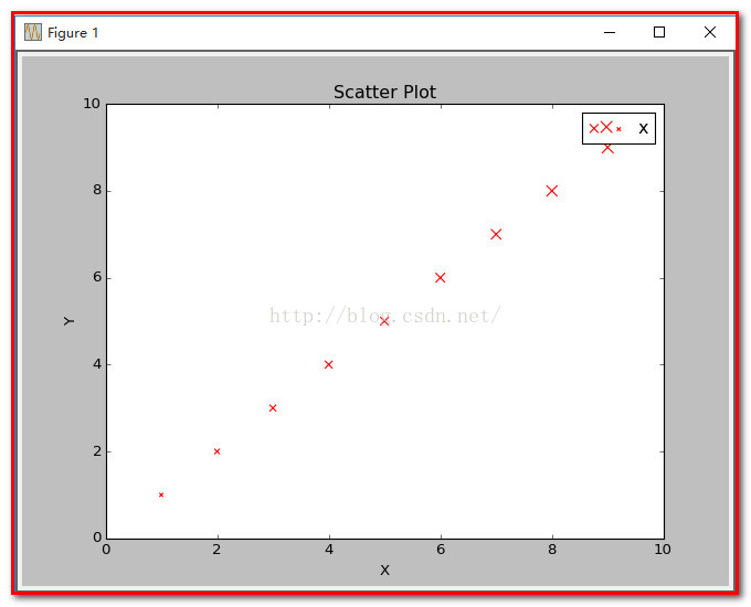
(2)、不同颜色
#导入必要的模块
import numpy as np
import matplotlib.pyplot as plt
#产生测试数据
x = np.arange(1,10)
y = x
fig = plt.figure()
ax1 = fig.add_subplot(111)
#设置标题
ax1.set_title('Scatter Plot')
#设置X轴标签
plt.xlabel('X')
#设置Y轴标签
plt.ylabel('Y')
#画散点图
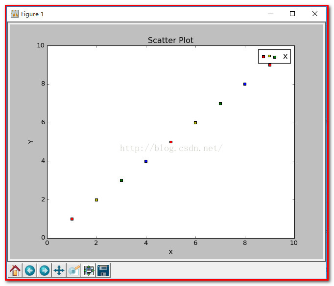
cValue = ['r','y','g','b','r','y','g','b','r']
ax1.scatter(x,y,c=cValue,marker='s')
#设置图标
plt.legend('x1')
#显示所画的图
plt.show() 结果:
(3)、线宽linewidths
#导入必要的模块
import numpy as np
import matplotlib.pyplot as plt
#产生测试数据
x = np.arange(1,10)
y = x
fig = plt.figure()
ax1 = fig.add_subplot(111)
#设置标题
ax1.set_title('Scatter Plot')
#设置X轴标签
plt.xlabel('X')
#设置Y轴标签
plt.ylabel('Y')
#画散点图
lValue = x
ax1.scatter(x,y,c='r',s= 100,linewidths=lValue,marker='o')
#设置图标
plt.legend('x1')
#显示所画的图
plt.show() 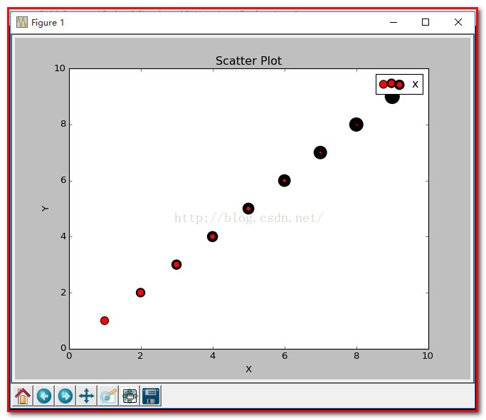
注: 这就是scatter基本的用法。
PS:下面举个示例
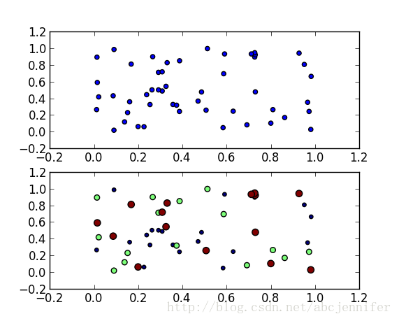
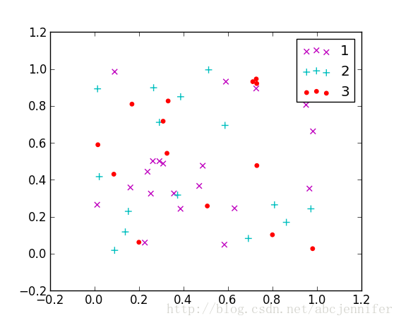
本文记录了python中的数据可视化——散点图scatter,令x作为数据(50个点,每个30维),我们仅可视化前两维。labels为其类别(假设有三类)。
这里的x就用random来了,具体数据具体分析。
label设定为[1:20]->1, [21:35]->2, [36:50]->3,(python中数组连接方法:先强制转为list,用+,再转回array)
用matplotlib的scatter绘制散点图,legend和matlab中稍有不同,详见代码。
x = rand(50,30)
from numpy import *
import matplotlib
import matplotlib.pyplot as plt

#basic
f1 = plt.figure(1)
plt.subplot(211)
plt.scatter(x[:,1],x[:,0])

# with label
plt.subplot(212)
label = list(ones(20))+list(2*ones(15))+list(3*ones(15))
label = array(label)
plt.scatter(x[:,1],x[:,0],15.0*label,15.0*label)

# with legend
f2 = plt.figure(2)
idx_1 = find(label==1)
p1 = plt.scatter(x[idx_1,1], x[idx_1,0], marker = 'x', color = 'm', label='1', s = 30)
idx_2 = find(label==2)
p2 = plt.scatter(x[idx_2,1], x[idx_2,0], marker = '+', color = 'c', label='2', s = 50)
idx_3 = find(label==3)
p3 = plt.scatter(x[idx_3,1], x[idx_3,0], marker = 'o', color = 'r', label='3', s = 15)
plt.legend(loc = 'upper right')
result:
figure(1):
figure(2):
以上就是本文的全部内容,希望对大家的学习有所帮助,也希望大家多多支持PHPERZ。