全面解析Bootstrap表单样式的使用
发布于 2017-06-14 22:56:43 | 265 次阅读 | 评论: 0 | 来源: 网友投递
这里有新鲜出炉的Bootstrap v3教程,程序狗速度看过来!
Bootstrap Web前端CSS框架
Bootstrap是Twitter推出的一个开源的用于前端开发的工具包。它由Twitter的设计师Mark Otto和Jacob Thornton合作开发,是一个CSS/HTML框架。Bootstrap提供了优雅的HTML和CSS规范,它即是由动态CSS语言Less写成。Bootstrap一经推出后颇受欢迎,一直是GitHub上的热门开源项目,包括NASA的MSNBC(微软全国广播公司)的Breaking News都使用了该项目。
这篇文章主要介绍了bootstrap表单样式的使用,本文介绍的非常详细,具有参考借鉴价值,感兴趣的朋友一起看看吧
本文主要给大家介绍了bootstrap表单样式的使用知识,非常不错,一起看看吧!
表单
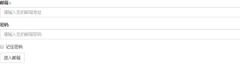
<form role="form">
<div class="form-group">
<label for="exampleInputEmail1">邮箱:</label>
<input type="email" class="form-control" id="exampleInputEmail1" placeholder="请输入您的邮箱地址">
</div>
<div class="form-group">
<label for="exampleInputPassword1">密码</label>
<input type="password" class="form-control" id="exampleInputPassword1" placeholder="请输入您的邮箱密码">
</div>
<div class="checkbox">
<label>
<input type="checkbox"> 记住密码
</label>
</div>
<button type="submit" class="btn btn-default">进入邮箱</button>
</form>
效果图:
class: form-control
1、宽度变成了100%,2、设置了一个浅灰色(#ccc)的边框,3、具有4px的圆角,4、设置阴影效果,并且元素得到焦点之时,阴影和边框效果会有所变化,5、设置了placeholder的颜色为#999
2、水平表单:
Bootstrap框架默认的表单是垂直显示风格,但很多时候我们需要的水平表单风格(标签居左,表单控件居右)
<form class="form-horizontal" role="form">
<div class="form-group">
<label for="inputEmail3" class="col-sm-2 control-label">邮箱</label>
<div class="col-sm-10">
<input type="email" class="form-control" id="inputEmail3" placeholder="请输入您的邮箱地址">
</div>
</div>
<div class="form-group">
<label for="inputPassword3" class="col-sm-2 control-label">密码</label>
<div class="col-sm-10">
<input type="password" class="form-control" id="inputPassword3" placeholder="请输入您的邮箱密码">
</div>
</div>
<div class="form-group">
<div class="col-sm-offset-2 col-sm-10">
<div class="checkbox">
<label>
<input type="checkbox"> 记住密码
</label>
</div>
</div>
</div>
<div class="form-group">
<div class="col-sm-offset-2 col-sm-10">
<button type="submit" class="btn btn-default">进入邮箱</button>
</div>
</div>
</form>
效果图:

在Bootstrap框架中要实现水平表单效果,必须满足以下两个条件:
1、在元素是使用类名“form-horizontal”。
2、配合Bootstrap框架的网格系统。
在元素上使用类名“form-horizontal”主要有以下几个作用:
- 设置表单控件padding和margin值。
- 改变“form-group”的表现形式,类似于网格系统的“row”。
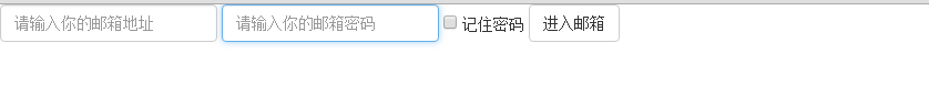
3、水平表单:
在Bootstrap框架中实现这样的表单效果是轻而易举的,你只需要在元素中添加类名“form-inline”即可。
内联表单实现原理非常简单,欲将表单控件在一行显示,就需要将表单控件设置成内联块元素(display:inline-block)。
<form class="form-inline" role="form">
<div class="form-group">
<label class="sr-only" for="exampleInputEmail2">邮箱</label>
<input type="email" class="form-control" id="exampleInputEmail2" placeholder="请输入你的邮箱地址">
</div>
<div class="form-group">
<label class="sr-only" for="exampleInputPassword2">密码</label>
<input type="password" class="form-control" id="exampleInputPassword2" placeholder="请输入你的邮箱密码">
</div>
<div class="checkbox">
<label>
<input type="checkbox"> 记住密码
</label>
</div>
<button type="submit" class="btn btn-default">进入邮箱</button>
</form>
效果图:
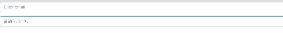
4、输入框input
单行输入框,常见的文本输入框,也就是input的type属性值为text。在Bootstrap中使用input时也必须添加type类型,如果没有指定type类型,将无法得到正确的样式.
<form role="form">
<div class="form-group">
<input type="email" class="form-control" placeholder="Enter email">
</div>
<div class="form-group">
<input type="text" class="form-control" placeholder="请输入用户名"/>
</div>
</form>
效果图:
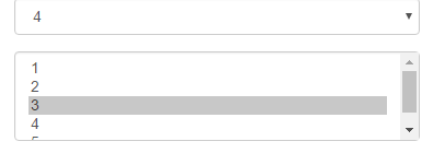
5、下拉选择框select
Bootstrap框架中的下拉选择框使用和原始的一致,多行选择设置multiple属性的值为multiple。Bootstrap框架会为这些元素提供统一的样式风格。
<form role="form">
<div class="form-group">
<select class="form-control">
<option>1</option>
<option>2</option>
<option>3</option>
<option>4</option>
<option>5</option>
</select>
</div>
<div class="form-group">
<select multiple class="form-control">
<option>1</option>
<option>2</option>
<option>3</option>
<option>4</option>
<option>5</option>
</select>
</div>
</form>
效果图:
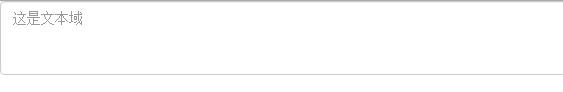
6、文本域textarea
文本域和原始使用方法一样,设置rows可定义其高度,设置cols可以设置其宽度。但如果textarea元素中添加了类名“form-control”类名,则无需设置cols属性。因为Bootstrap框架中的“form-control”样式的表单控件宽度为100%或auto。
<form role="form">
<div class="form-group">
<textarea class="form-control" rows="3"></textarea>
</div>
</form>
效果图:
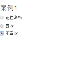
7.复选框checkbox和单选择按钮radio
Bootstrap框架中checkbox和radio有点特殊,Bootstrap针对他们做了一些特殊化处理,主要是checkbox和radio与label标签配合使用会出现一些小问题(最头痛的是对齐问题)。使用Bootstrap框架,开发人员无需考虑太多,只需要按照下面的方法使用即可。
<form role="form">
<h3>案例1</h3>
<div class="checkbox">
<label>
<input type="checkbox" value="">
记住密码
</label>
</div>
<div class="radio">
<label>
<input type="radio" name="optionsRadios" id="optionsRadios1" value="love" checked>
喜欢
</label>
</div>
<div class="radio">
<label>
<input type="radio" name="optionsRadios" id="optionsRadios2" value="hate">
不喜欢
</label>
</div>
</form>
效果图:
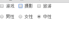
8.复选框和单选按钮水平排列
有时候,为了布局的需要,将复选框和单选按钮需要水平排列。Bootstrap框架也做了这方面的考虑:
1、如果checkbox需要水平排列,只需要在label标签上添加类名“checkbox-inline”
2、如果radio需要水平排列,只需要在label标签上添加类名“radio-inline”
<form role="form">
<div class="form-group">
<label class="checkbox-inline">
<input type="checkbox" value="option1">游戏
</label>
<label class="checkbox-inline">
<input type="checkbox" value="option2">摄影
</label>
<label class="checkbox-inline">
<input type="checkbox" value="option3">旅游
</label>
</div>
<div class="form-group">
<label class="radio-inline">
<input type="radio" value="option1" name="sex">男性
</label>
<label class="radio-inline">
<input type="radio" value="option2" name="sex">女性
</label>
<label class="radio-inline">
<input type="radio" value="option3" name="sex">中性
</label>
</div>
</form>
效果图:
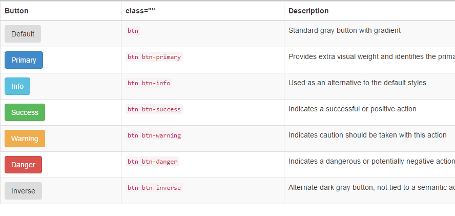
9.按钮
在Bootstrap框架中的按钮都是采用来实现
<table class="table table-bordered table-striped">
<thead>
<tr>
<th>Button</th>
<th>class=""</th>
<th>Description</th>
</tr>
</thead>
<tbody>
<tr>
<td><button class="btn" href="#">Default</button></td>
<td><code>btn</code></td>
<td>Standard gray button with gradient</td>
</tr>
<tr>
<td><button class="btn btn-primary" href="#">Primary</button></td>
<td><code>btn btn-primary</code></td>
<td>Provides extra visual weight and identifies the primary action in a set of buttons</td>
</tr>
<tr>
<td><button class="btn btn-info" href="#">Info</button></td>
<td><code>btn btn-info</code></td>
<td>Used as an alternative to the default styles</td>
</tr>
<tr>
<td><button class="btn btn-success" href="#">Success</button></td>
<td><code>btn btn-success</code></td>
<td>Indicates a successful or positive action</td>
</tr>
<tr>
<td><button class="btn btn-warning" href="#">Warning</button></td>
<td><code>btn btn-warning</code></td>
<td>Indicates caution should be taken with this action</td>
</tr>
<tr>
<td><button class="btn btn-danger" href="#">Danger</button></td>
<td><code>btn btn-danger</code></td>
<td>Indicates a dangerous or potentially negative action</td>
</tr>
<tr>
<td><button class="btn btn-inverse" href="#">Inverse</button></td>
<td><code>btn btn-inverse</code></td>
<td>Alternate dark gray button, not tied to a semantic action or use</td>
</tr>
</tbody>
</table>
效果图:
10.表单控件大小
前面看到的表单控件都正常的大小。可以通过设置控件的height,line-height,padding和font-size等属性来实现控件的高度设置。不过Bootstrap框架还提供了两个不同的类名,用来控制表单控件的高度。这两个类名是:
1、input-sm:让控件比正常大小更小
2、input-lg:让控件比正常大小更大
这两个类适用于表单中的input,textarea和select控件.
<form role="form">
<div class="form-group">
<label class="control-label">控件变大</label>
<input class="form-control input-lg" type="text" placeholder="添加.input-lg,控件变大">
</div>
<div class="form-group">
<label class="control-label">正常大小</label>
<input class="form-control" type="text" placeholder="正常大小">
</div>
<div class="form-group">
<label class="control-label">控件变小</label>
<input class="form-control input-sm" type="text" placeholder="添加.input-sm,控件变小">
</div>
</form>
效果图:

11.表单控件状态(禁用状态)
Bootstrap框架的表单控件的禁用状态和普通的表单禁用状态实现方法是一样的,在相应的表单控件上添加属性“disabled”。具体的看下面的代码
禁用单个表单标签,只需要在标签的属性中加入disabled
<form role="form" class="form-horizontal">
<div class="form-group">
<div class="col-xs-6">
<input class="form-control input-lg" id="disabledInput" type="text" placeholder="表单已被禁用,不可输入" disabled>
</div>
</div>
</form>
效果图:

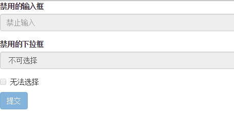
在Bootstrap框架中,如果fieldset设置了disabled属性,整个域都将处于被禁用状态。
<form role="form">
<fieldset disabled>
<div class="form-group">
<label for="disabledTextInput">禁用的输入框</label>
<input type="text" id="disabledTextInput" class="form-control" placeholder="禁止输入">
</div>
<div class="form-group">
<label for="disabledSelect">禁用的下拉框</label>
<select id="disabledSelect" class="form-control">
<option>不可选择</option>
</select>
</div>
<div class="checkbox">
<label>
<input type="checkbox"> 无法选择
</label>
</div>
<button type="submit" class="btn btn-primary">提交</button>
</fieldset>
</form>
效果图:
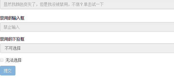
据说对于整个禁用的域中,如果legend中有输入框的话,这个输入框是无法被禁用的。
form role="form">
<fieldset disabled>
<legend><input type="text" class="form-control" placeholder="显然我颜色变灰了,但是我没被禁用,不信?单击试一下" /></legend>
<div class="form-group">
<label for="disabledTextInput">禁用的输入框</label>
<input type="text" id="disabledTextInput" class="form-control" placeholder="禁止输入">
</div>
<div class="form-group">
<label for="disabledSelect">禁用的下拉框</label>
<select id="disabledSelect" class="form-control">
<option>不可选择</option>
</select>
</div>
<div class="checkbox">
<label>
<input type="checkbox"> 无法选择
</label>
</div>
<button type="submit" class="btn btn-primary">提交</button>
</fieldset>
</form>
效果图:
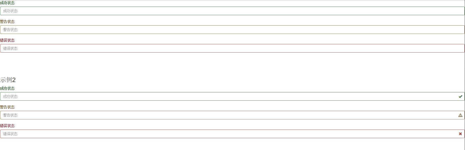
表单验证状态
在制作表单时,不免要做表单验证。同样也需要提供验证状态样式,在Bootstrap框架中同样提供这几种效果。
1、.has-warning:警告状态(黄色)
2、.has-error:错误状态(红色)
3、.has-success:成功状态(绿色)
很多时候,在表单验证的时候,不同的状态会提供不同的 icon,比如成功是一个对号(√),错误是一个叉号(×)等。在Bootstrap框中也提供了这样的效果。如果你想让表单在对应的状态下显示 icon 出来,只需要在对应的状态下添加类名“has-feedback”。请注意,此类名要与“has-error”、“has-warning”和“has-success”在一起:
<form role="form">
<div class="form-group has-success">
<label class="control-label" for="inputSuccess1">成功状态</label>
<input type="text" class="form-control" id="inputSuccess1" placeholder="成功状态">
</div>
<div class="form-group has-warning">
<label class="control-label" for="inputWarning1">警告状态</label>
<input type="text" class="form-control" id="inputWarning1" placeholder="警告状态">
</div>
<div class="form-group has-error">
<label class="control-label" for="inputError1">错误状态</label>
<input type="text" class="form-control" id="inputError1" placeholder="错误状态">
</div>
</form>
<br>
<br>
<br>
<form role="form">
<div class="form-group has-success has-feedback">
<label class="control-label" for="inputSuccess1">成功状态</label>
<input type="text" class="form-control" id="inputSuccess1" placeholder="成功状态">
<span class="glyphicon glyphicon-ok form-control-feedback"></span>
</div>
<div class="form-group has-warning has-feedback">
<label class="control-label" for="inputWarning1">警告状态</label>
<input type="text" class="form-control" id="inputWarning1" placeholder="警告状态">
<span class="glyphicon glyphicon-warning-sign form-control-feedback"></span>
</div>
<div class="form-group has-error has-feedback">
<label class="control-label" for="inputError1">错误状态</label>
<input type="text" class="form-control" id="inputError1" placeholder="错误状态">
<span class="glyphicon glyphicon-remove form-control-feedback"></span>
</div>
</form>
效果图:

表单提示信息
平常在制作表单验证时,要提供不同的提示信息。在Bootstrap框架中也提供了这样的效果。使用了一个”help-block”样式,将提示信息以块状显示,并且显示在控件底部。
<form role="form">
<div class="form-group has-success has-feedback">
<label class="control-label" for="inputSuccess1">成功状态</label>
<input type="text" class="form-control" id="inputSuccess1" placeholder="成功状态">
<span class="help-block">你输入的信息是正确的</span>
<span class="glyphicon glyphicon-ok form-control-feedback"></span>
</div>
<div class="form-group has-warning has-feedback">
<label class="control-label" for="inputWarning1">警告状态</label>
<input type="text" class="form-control" id="inputWarning1" placeholder="警告状态">
<span class="help-block">请输入正确信息</span>
<span class="glyphicon glyphicon-warning-sign form-control-feedback"></span>
</div>
<div class="form-group has-error has-feedback">
<label class="control-label" for="inputError1">错误状态</label>
<input type="text" class="form-control" id="inputError1" placeholder="错误状态">
<span class="help-block">你输入的信息是错误的</span>
<span class="glyphicon glyphicon-remove form-control-feedback"></span>
</div>
</form>
效果图:

以上所述是小编给大家介绍的Bootstrap表单样式的使用,希望对大家有所帮助,如果大家有任何疑问请给我留言,小编会及时回复大家的。在此也非常感谢大家对phperz网站的支持!