BootStrap入门教程(二)之固定的内置样式
发布于 2017-04-27 13:30:34 | 108 次阅读 | 评论: 0 | 来源: 网友投递
Bootstrap Web前端CSS框架
Bootstrap是Twitter推出的一个开源的用于前端开发的工具包。它由Twitter的设计师Mark Otto和Jacob Thornton合作开发,是一个CSS/HTML框架。Bootstrap提供了优雅的HTML和CSS规范,它即是由动态CSS语言Less写成。Bootstrap一经推出后颇受欢迎,一直是GitHub上的热门开源项目,包括NASA的MSNBC(微软全国广播公司)的Breaking News都使用了该项目。
这篇文章主要介绍了BootStrap入门教程(二)之固定的内置样式的相关资料,本文介绍的非常详细,具有参考借鉴价值,感兴趣的朋友一起看看吧
相关阅读:
HTML5文档类型(Doctype)
Bootstrap使用了一些HTML5元素和CSS属性,所以需要使用HTML5文档类型。
<!DOCTYPE html>
<html>
....
</html>
移动设备优先
<meta name=”viewport” content=”width=device-width, initial-scale=1.0”> 宽度设置为device-width可以确保它能正确呈现在不同设备上。
initial-scale=1.0确保网页加载时,以1:1的比例呈现。
可以为viewport meta标签添加user-scalable=no来禁止其缩放功能。
<meta name="viewport" content="width=device-width,
initial-scale=1.0,
maximum-scale=1.0,
user-scalable=no">
响应式图像
<img src="..." class="img-responsive" alt="响应式图像">
  bootstrap.css里设置了img-responsive的属性:
.img-responsive {
display: inline-block;
height: auto;
max-width: 100%;
}
基本的全局显示
body {
font-family: "Helvetica Neue", Helvetica, Arial, sans-serif;
font-size: 14px;
line-height: 1.428571429;
color: #333333;
background-color: #ffffff;
}
body {margin:0}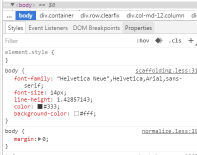
链接样式
a:hover,
a:focus {
color: #2a6496;
text-decoration: underline;
}
a:focus {
outline: thin dotted #333;
outline: 5px auto -webkit-focus-ring-color;
outline-offset: -2px;
}
默认设置有好有坏,难免嘛。
不想要下划线的话可以在a链接上加一个名为btn的class,该class的默认设置如下:
a:hover,
a:focus {
color: #2a6496;
text-decoration: underline;}
a:focus {
outline: thin dotted #333;
outline: 5px auto -webkit-focus-ring-color;
outline-offset: -2px;}
避免跨浏览器的不一致
Normalize.css提供了更好的跨浏览器一致性。
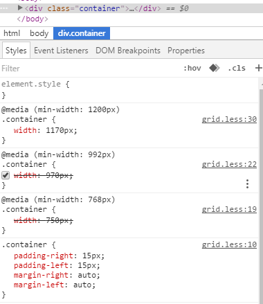
容器(Container)
<div class=”container”>
..
</div>
.container的样式:
.container {
padding-right: 15px;
padding-left: 15px;
margin-right: auto;
margin-left: auto;
}
左右外边距交由浏览器决定。
由于内边距是固定宽度,默认情况下容器是不可嵌套的。
.container:before,.container:after {
display: table;
content: " ";
}
设置display为table,会创建一个匿名的table-cell和一个新的块格式化上下文。:before伪元素防止上边距崩塌,:after伪元素清除浮动。content:” ”修复一些Opera bug。
.container:after {
clear: both;
}
另外还有申请相应的媒体查询:
@media (min-width: 768px) {
.container {
width: 750px;
  }
}
Bootstrap浏览器/设备支持
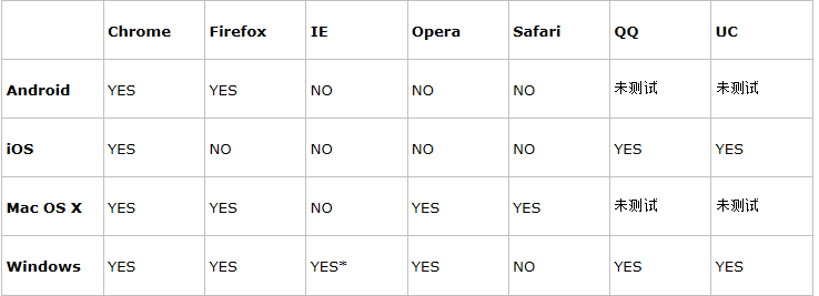
* Bootstrap 支持 Internet Explorer 8 及更高版本的 IE 浏览器。
参考:http://www.runoob.com/bootstrap/bootstrap-css-overview.html
以上所述是小编给大家介绍的BootStrap入门教程(二)之固定的内置样式,希望对大家有所帮助,如果大家有任何疑问请给我留言,小编会及时回复大家的。在此也非常感谢大家对phperz网站的支持!