JS组件Bootstrap实现弹出框和提示框效果代码
发布于 2017-04-26 07:05:50 | 161 次阅读 | 评论: 0 | 来源: 网友投递
Bootstrap Web前端CSS框架
Bootstrap是Twitter推出的一个开源的用于前端开发的工具包。它由Twitter的设计师Mark Otto和Jacob Thornton合作开发,是一个CSS/HTML框架。Bootstrap提供了优雅的HTML和CSS规范,它即是由动态CSS语言Less写成。Bootstrap一经推出后颇受欢迎,一直是GitHub上的热门开源项目,包括NASA的MSNBC(微软全国广播公司)的Breaking News都使用了该项目。
这篇文章主要介绍了JS组件Bootstrap实现弹出框和提示框效果代码,对弹出框和提示框感兴趣的小伙伴们可以参考一下
前言:对于Web开发人员,弹出框和提示框的使用肯定不会陌生,比如常见的表格新增和编辑功能,一般常见的主要有两种处理方式:行内编辑和弹出框编辑。在增加用户体验方面,弹出框和提示框起着重要的作用,如果你的系统有一个友好的弹出提示框,自然能给用户很好的页面体验。前面几章介绍了bootstrap的几个常用组件,这章来看看bootstrap里面弹出框和提示框的处理。总的来说,弹出提示主要分为三种:弹出框、确定取消提示框、信息提示框。本篇就结合这三种类型分别来介绍下它们的使用。
一、Bootstrap弹出框
使用过JQuery UI应该知道,它里面有一个dialog的弹出框组件,功能也很丰富。与jQuery UI的dialog类似,Bootstrap里面也内置了弹出框组件。打开bootstrap 文档可以看到它的dialog是直接嵌入到bootstrap.js和bootstrap.css里面的,也就是说,只要我们引入了bootstrap的文件,就可以直接使用它的dialog组件,是不是很方便。本篇我们就结合新增编辑的功能来介绍下bootstrap dialog的使用。废话不多说,直接看来它如何使用吧。
1、cshtml界面代码
<div class="modal fade" id="myModal" tabindex="-1" role="dialog" aria-labelledby="myModalLabel">
 <div class="modal-dialog" role="document">
  <div class="modal-content">
  <div class="modal-header">
   <button type="button" class="close" data-dismiss="modal" aria-label="Close"><span aria-hidden="true">×</span></button>
   <h4 class="modal-title" id="myModalLabel">新增</h4>
  </div>
  <div class="modal-body">

   <div class="form-group">
   <label for="txt_departmentname">部门名称</label>
   <input type="text" name="txt_departmentname" class="form-control" id="txt_departmentname" placeholder="部门名称">
   </div>
   <div class="form-group">
   <label for="txt_parentdepartment">上级部门</label>
   <input type="text" name="txt_parentdepartment" class="form-control" id="txt_parentdepartment" placeholder="上级部门">
   </div>
   <div class="form-group">
   <label for="txt_departmentlevel">部门级别</label>
   <input type="text" name="txt_departmentlevel" class="form-control" id="txt_departmentlevel" placeholder="部门级别">
   </div>
   <div class="form-group">
   <label for="txt_statu">描述</label>
   <input type="text" name="txt_statu" class="form-control" id="txt_statu" placeholder="状态">
   </div>
  </div>
  <div class="modal-footer">
   <button type="button" class="btn btn-default" data-dismiss="modal"><span class="glyphicon glyphicon-remove" aria-hidden="true"></span>关闭</button>
   <button type="button" id="btn_submit" class="btn btn-primary" data-dismiss="modal"><span class="glyphicon glyphicon-floppy-disk" aria-hidden="true"></span>保存</button>
  </div>
  </div>
 </div>
 </div>
最外面的div定义了dialog的隐藏。我们重点来看看第二层的div
<div class="modal-dialog" role="document">
这个div定义了dialog,对应的class有三种尺寸的弹出框,如下:
<div class="modal-dialog" role="document">
<div class="modal-dialog modal-lg" role="document">
<div class="modal-dialog modal-full" role="document">
第一种表示默认类型的弹出框;第二种表示增大的弹出框;第三种表示满屏的弹出框。role="document"表示弹出框的对象的当前的document。
2、js里面将dialog show出来。
默认情况下,我们的弹出框是隐藏的,只有在用户点击某个操作的时候才会show出来。来看看js里面是如何处理的吧:
 //注册新增按钮的事件
 $("#btn_add").click(function () {
  $("#myModalLabel").text("新增");
  $('#myModal').modal();
 });
对,你没有看错,只需要这一句就能show出这个dialog.
$('#myModal').modal();
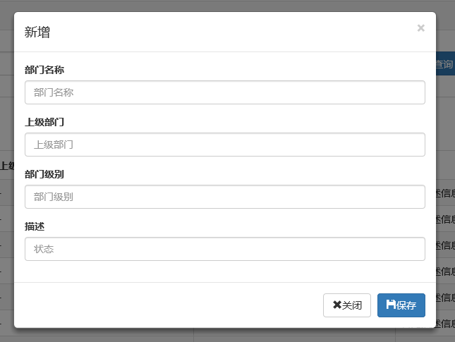
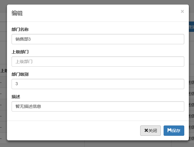
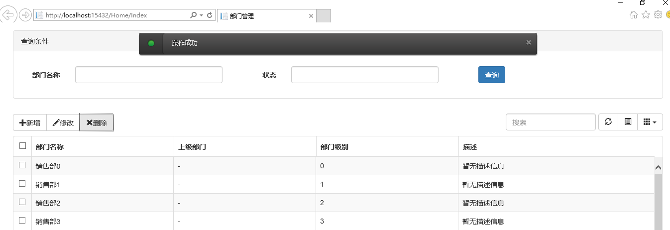
3、效果展示
新增效果
编辑效果
4、说明
弹出框显示后,点击界面上其他地方以及按Esc键都能隐藏弹出框,这样使得用户的操作更加友好。关于dialog里面关闭和保存按钮的事件的初始化在项目里面一般是封装过的,这个我们待会来看。
二、确认取消提示框
这种类型的提示框一般用于某些需要用户确定才能进行的操作,比较常见的如:删除操作、提交订单操作等。
1、使用bootstrap弹出框确认取消提示框
介绍这个组件之前,就得说说组件封装了,我们知道,像弹出框、确认取消提示框、信息提示框这些东西项目里面肯定是多处都要调用的,所以我们肯定是要封装组件的。下面就来看看我们封装的缺乏取消提示框。
(function ($) {

 window.Ewin = function () {
 var html = '<div id="[Id]" class="modal fade" role="dialog" aria-labelledby="modalLabel">' +
    '<div class="modal-dialog modal-sm">' +
     '<div class="modal-content">' +
     '<div class="modal-header">' +
      '<button type="button" class="close" data-dismiss="modal"><span aria-hidden="true">×</span><span class="sr-only">Close</span></button>' +
      '<h4 class="modal-title" id="modalLabel">[Title]</h4>' +
     '</div>' +
     '<div class="modal-body">' +
     '<p>[Message]</p>' +
     '</div>' +
     '<div class="modal-footer">' +
 '<button type="button" class="btn btn-default cancel" data-dismiss="modal">[BtnCancel]</button>' +
 '<button type="button" class="btn btn-primary ok" data-dismiss="modal">[BtnOk]</button>' +
 '</div>' +
     '</div>' +
    '</div>' +
    '</div>';


 var dialogdHtml = '<div id="[Id]" class="modal fade" role="dialog" aria-labelledby="modalLabel">' +
    '<div class="modal-dialog">' +
     '<div class="modal-content">' +
     '<div class="modal-header">' +
      '<button type="button" class="close" data-dismiss="modal"><span aria-hidden="true">×</span><span class="sr-only">Close</span></button>' +
      '<h4 class="modal-title" id="modalLabel">[Title]</h4>' +
     '</div>' +
     '<div class="modal-body">' +
     '</div>' +
     '</div>' +
    '</div>' +
    '</div>';
 var reg = new RegExp("\\[([^\\[\\]]*?)\\]", 'igm');
 var generateId = function () {
  var date = new Date();
  return 'mdl' + date.valueOf();
 }
 var init = function (options) {
  options = $.extend({}, {
  title: "操作提示",
  message: "提示内容",
  btnok: "确定",
  btncl: "取消",
  width: 200,
  auto: false
  }, options || {});
  var modalId = generateId();
  var content = html.replace(reg, function (node, key) {
  return {
   Id: modalId,
   Title: options.title,
   Message: options.message,
   BtnOk: options.btnok,
   BtnCancel: options.btncl
  }[key];
  });
  $('body').append(content);
  $('#' + modalId).modal({
  width: options.width,
  backdrop: 'static'
  });
  $('#' + modalId).on('hide.bs.modal', function (e) {
  $('body').find('#' + modalId).remove();
  });
  return modalId;
 }

 return {
  alert: function (options) {
  if (typeof options == 'string') {
   options = {
   message: options
   };
  }
  var id = init(options);
  var modal = $('#' + id);
  modal.find('.ok').removeClass('btn-success').addClass('btn-primary');
  modal.find('.cancel').hide();

  return {
   id: id,
   on: function (callback) {
   if (callback && callback instanceof Function) {
    modal.find('.ok').click(function () { callback(true); });
   }
   },
   hide: function (callback) {
   if (callback && callback instanceof Function) {
    modal.on('hide.bs.modal', function (e) {
    callback(e);
    });
   }
   }
  };
  },
  confirm: function (options) {
  var id = init(options);
  var modal = $('#' + id);
  modal.find('.ok').removeClass('btn-primary').addClass('btn-success');
  modal.find('.cancel').show();
  return {
   id: id,
   on: function (callback) {
   if (callback && callback instanceof Function) {
    modal.find('.ok').click(function () { callback(true); });
    modal.find('.cancel').click(function () { callback(false); });
   }
   },
   hide: function (callback) {
   if (callback && callback instanceof Function) {
    modal.on('hide.bs.modal', function (e) {
    callback(e);
    });
   }
   }
  };
  },
  dialog: function (options) {
  options = $.extend({}, {
   title: 'title',
   url: '',
   width: 800,
   height: 550,
   onReady: function () { },
   onShown: function (e) { }
  }, options || {});
  var modalId = generateId();

  var content = dialogdHtml.replace(reg, function (node, key) {
   return {
   Id: modalId,
   Title: options.title
   }[key];
  });
  $('body').append(content);
  var target = $('#' + modalId);
  target.find('.modal-body').load(options.url);
  if (options.onReady())
   options.onReady.call(target);
  target.modal();
  target.on('shown.bs.modal', function (e) {
   if (options.onReady(e))
   options.onReady.call(target, e);
  });
  target.on('hide.bs.modal', function (e) {
   $('body').find(target).remove();
  });
  }
 }
 }();
})(jQuery);
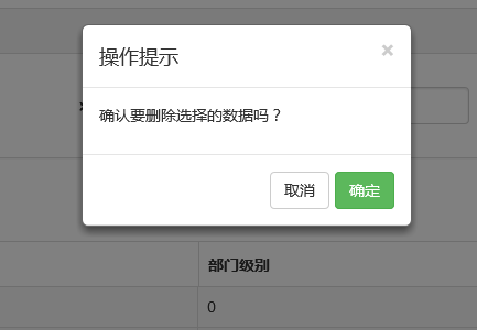
不了解组件封装的朋友可以先看看相关文章。这里我们的确认取消提示框主要用到了confirm这个属性对应的方法。还是来看看如何调用吧:
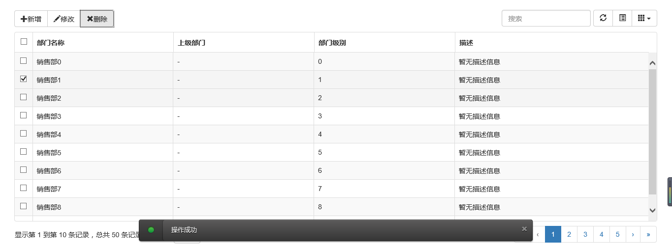
 //注册删除按钮的事件
 $("#btn_delete").click(function () {
  //取表格的选中行数据
  var arrselections = $("#tb_departments").bootstrapTable('getSelections');
  if (arrselections.length <= 0) {
  toastr.warning('请选择有效数据');
  return;
  }

  Ewin.confirm({ message: "确认要删除选择的数据吗?" }).on(function (e) {
  if (!e) {
   return;
  }
  $.ajax({
   type: "post",
   url: "/api/DepartmentApi/Delete",
   data: { "": JSON.stringify(arrselections) },
   success: function (data, status) {
   if (status == "success") {
    toastr.success('提交数据成功');
    $("#tb_departments").bootstrapTable('refresh');
   }
   },
   error: function () {
   toastr.error('Error');
   },
   complete: function () {

   }

  });
  });
 });
message属性传入提示的信息,on里面注入点击按钮后的回调事件。
生成的效果:
2、bootbox组件的使用
在网上找bootstrap的弹出组件时总是可以看到bootbox这么一个东西,确实是一个很简单的组件,还是来看看如何使用吧。
当然要使用它必须要添加组件喽。无非也是两种方式:引入源码和Nuget。
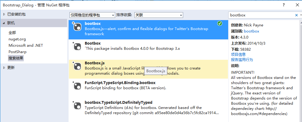
接下来就是使用它了。首先当然是添加bootbox.js的引用了。然后就是在相应的地方调用了。
$("#btn_delete").click(function () {
  var arrselections = $("#tb_departments").bootstrapTable('getSelections');
  if (arrselections.length <= 0) {
  toastr.warning('请选择有效数据');
  return;
  }

  bootbox.alert("确认删除", function () {
  var strResult = "";
  })
  bootbox.prompt("确认删除", function (result) {
  var strResult = result;
  })
  bootbox.confirm("确认删除", function (result) {
  var strResult = result;
  })

 });
效果展示:
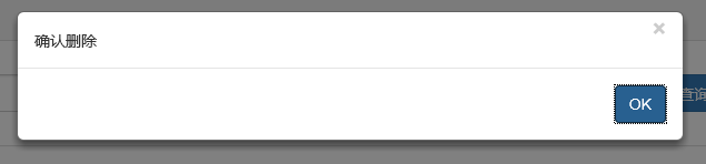
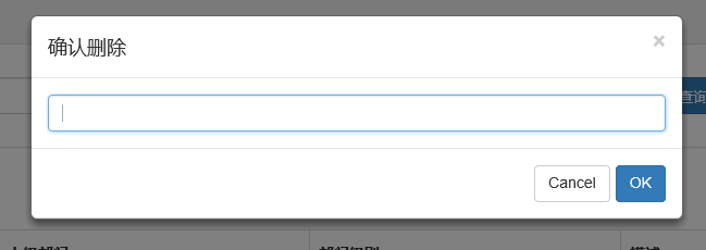
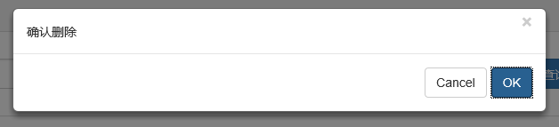
更多用法可以参见api。使用起来基本很简单。这个组件最大的特点就是和bootstrap的风格能够很好的保持一致。
3、在网上还找到一个效果比较炫一点的提示框:sweetalert

要使用它,还是老规矩:Nuget。
(1)文档
(2)在cshtml页面引入js和css
<link href="~/Styles/sweetalert.css" rel="stylesheet" />
<script src="~/Scripts/sweetalert.min.js"></script>
(3)js使用
 swal({
  title: "操作提示", //弹出框的title
  text: "确定删除吗?", //弹出框里面的提示文本
  type: "warning", //弹出框类型
  showCancelButton: true, //是否显示取消按钮
  confirmButtonColor: "#DD6B55",//确定按钮颜色
  cancelButtonText: "取消",//取消按钮文本
  confirmButtonText: "是的,确定删除!",//确定按钮上面的文档
  closeOnConfirm: true
  }, function () {
   $.ajax({
   type: "post",
   url: "/Home/Delete",
   data: { "": JSON.stringify(arrselections) },
   success: function (data, status) {
    if (status == "success") {
    toastr.success('提交数据成功');
    $("#tb_departments").bootstrapTable('refresh');
    }
   },
   error: function () {
    toastr.error('Error');
   },
   complete: function () {

   }

   });
  });
(4)效果展示:

点击确定后进入回调函数:
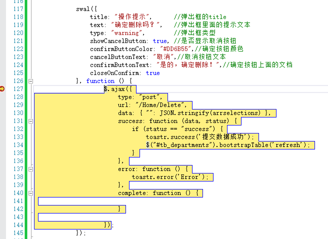
组件很多,用哪种园友没可以自行决定,不过博主觉得像一些互联网、电子商务类型的网站用sweetalert效果比较合适,一般的内部系统可能也用不上。
三、操作完成提示框
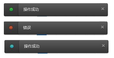
1、toastr.js组件
关于信息提示框,博主项目中使用的是toastr.js这么一个组件,这个组件最大的好处就是异步、无阻塞,提示后可设置消失时间,并且可以将消息提示放到界面的各个地方。先来看看效果。
显示在不同位置:
top-center位置
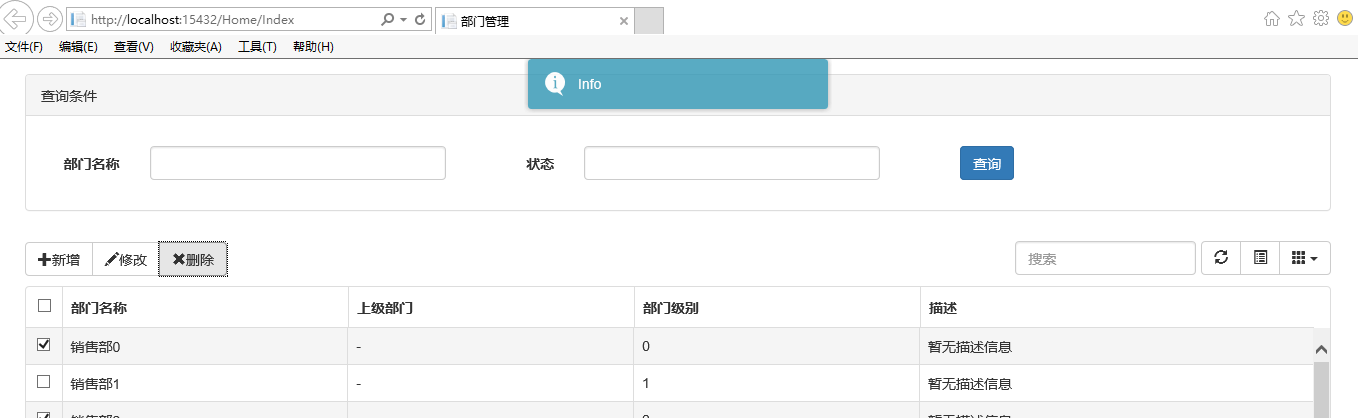
bottom-left位置
关于它的使用。
(1)、引入js和css
<link href="~/Content/toastr/toastr.css" rel="stylesheet" />
<script src="~/Content/toastr/toastr.min.js"></script>
(2)、js初始化
<script type="text/javascript">
 toastr.options.positionClass = 'toast-bottom-right';
 </script>
将这个属性值设置为不同的值就能让提示信息显示在不同的位置,如toast-bottom-right表示下右、toast-bottom-center表示下中、toast-top-center表示上中等,更过位置信息请查看文档。
(3)、使用
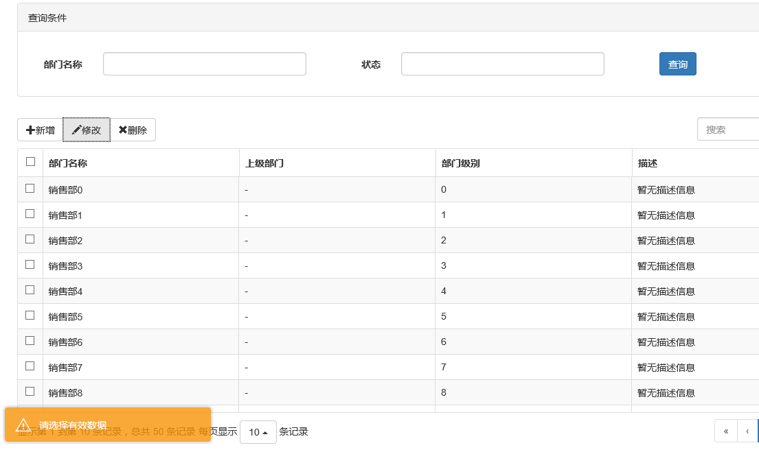
//初始化编辑按钮
$("#btn_edit").click(function () {
  var arrselections = $("#tb_departments").bootstrapTable('getSelections');
  if (arrselections.length > 1) {
  toastr.warning('只能选择一行进行编辑');

  return;
  }
  if (arrselections.length <= 0) {
  toastr.warning('请选择有效数据');

  return;
  }

  $('#myModal').modal();
 });
使用起来就如下一句:
toastr.warning('只能选择一行进行编辑');
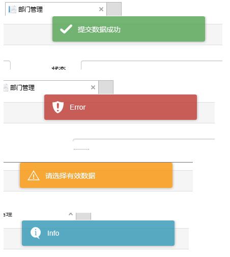
是不是很简单~~这里的有四种方法分别对应四种不同颜色的提示框。
toastr.success('提交数据成功');
toastr.error('Error');
toastr.warning('只能选择一行进行编辑');
toastr.info('info');
分别对应上图中的四种颜色的提示框。
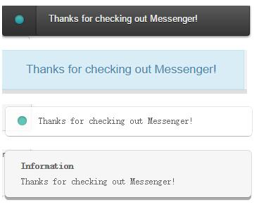
2、Messenger组件
在Bootstrap中文网里面提到了一个alert组件:Messenger。
它的使用和toastr.js这个组件基本相似,只不过效果有点不太一样。我们还是来看看它是如何使用的。
(1)效果展示
可以定位到网页的不同位置,例如下图中给出的下中位置、上中位置。
提示框的样式有三种状态:Success、Error、Info
并且支持四种不同样式的提示框:Future、Block、Air、Ice
(2)组件使用以及代码示例
关于它的使用和toastr大同小异,首先引入组件:
<script src="~/Content/HubSpot-messenger-a3df9a6/build/js/messenger.js"></script>
 <link href="~/Content/HubSpot-messenger-a3df9a6/build/css/messenger.css" rel="stylesheet" />
 <link href="~/Content/HubSpot-messenger-a3df9a6/build/css/messenger-theme-future.css" rel="stylesheet" />
初始化它的位置
 <script type="text/javascript">
 $._messengerDefaults = {
  extraClasses: 'messenger-fixed messenger-theme-future messenger-on-bottom messenger-on-right'
 }
 </script>
然后js里面使用如下:
 $("#btn_delete").click(function () {
  $.globalMessenger().post({
  message: "操作成功",//提示信息
  type: 'info',//消息类型。error、info、success
  hideAfter: 2,//多长时间消失
  showCloseButton:true,//是否显示关闭按钮
  hideOnNavigate: true //是否隐藏导航
 });
 });
如果提示框使用默认样式,也只有一句就能解决
 $.globalMessenger().post({
  message: "操作成功",//提示信息
  type: 'info',//消息类型。error、info、success
 });
很简单很强大有木有~~
四、总结
以上花了几个小时时间整理出来的几种常用bootstrap常用弹出和提示框的效果以及使用小结,希望对大家的学习有所帮助。