使用jQuery Mobile框架开发移动端Web App的入门教程
发布于 2017-04-08 12:14:25 | 475 次阅读 | 评论: 0 | 来源: 网友投递
jQuery Mobile jQuery的移动设备版
jQuery Mobile是jQuery 在手机上和平板设备上的版本。jQuery Mobile 不仅会给主流移动平台带来jQuery核心库,而且会发布一个完整统一的jQuery移动UI框架。支持全球主流的移动平台。jQuery Mobile开发团队说:能开发这个项目,我们非常兴奋。移动Web太需要一个跨浏览器的框架,让开发人员开发出真正的移动Web网站。
jQuery Mobile是移动端的基于jQuery的Web前端开发框架,移动设备上的浏览器对HTML5的支持普遍较强,因而jQuery Mobile的UI设计主要针对HTML5,下面就来详细看一下使用jQuery Mobile框架开发移动端Web App的入门教程
一.jQuery Mobile 的渐进增强设计与浏览器支持
根据维基百科( Wikipedia ) 的解释,渐进增强的设计主要包括以下几点
- basic content should be accessible to all web browsers (所有浏览器都应能访问全部基础的内容)
- basic functionality should be accessible to all web browsers (所有浏览器都应能访问全部基础的功能)
- sparse, semantic markup contains all content (所有的内容应该在少量语义标签内)
- enhanced layout is provided by externally linked CSS (增强的功能应该由外部 CSS 提供)
- enhanced behavior is provided by unobtrusive, externally linked JavaScript (增强的行为由外部 JavaScript 提供 )
- end-user web browser preferences are respected (终端用户的浏览器习惯应受尊重)
若在实际的开发中使用到 Web SQL Database 等 HTML5 技术,则最终的 Web App 被支持度会比以上 jQuery Mobile 的被支持度低,但两个主流的移动浏览器 Android 与 Apple iOS 的系统浏览器及其桌面版本肯定能提供最好的支持。
二.HTML5 data-* 属性
jQuery Mobile 依赖 HTML5 data-* 属性 来提供一系列的支持( UI 组件、过渡和页面结构),不支持该 HTML5 属性的浏览器会默认忽略这些属性的效果,比如在页面中添加一个版头,可以使用以下的 HTML:
<div data-role="header">
  <h1>jQuery Mobile Demo</h1>
</div>
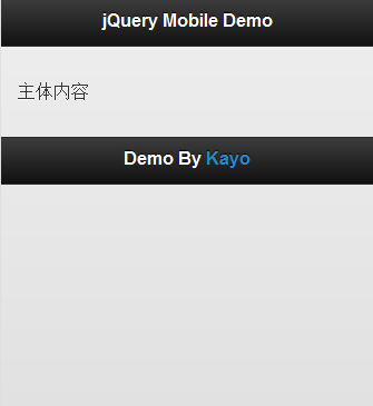
这样就能产生一个 jQuery Mobile 样式的版头,从下文的图中可以看出,这样的版头样式很适合移动设备使用,并且在添加 data-role="header" 属性后,div 内的 h1 也会被渲染成一定样式,这就是 jQuery Mobile 的方便快捷,也是它的设计宗旨—— Write Less, Do More 。
除此之外 jQuery Mobile 中还有以下的 data-role 属性(部分属性),已经赋予了一定的样式及用户操作响应效果。
data-role="content" , data-role="button" , data-theme ="" , data-role="controlgroup" , data-inline="true" , data-role="fieldcontain" , data-role="listview" , data-rel="dialog" , data-transition="pop" ,分别对应着主体内容、按钮,主题颜色,已编辑按钮,内联按钮,表单元素,列表视图,对话框,页面过渡。
三.jQuery Mobile 基本使用方法
1.引入 jQuery Mobile
使用 jQuery Mobile ,需要在网页页眉中引入 jQuery Mobile 组件,包括以下部分
(1)jQuery 库
(2)jQuery Mobile CSS
(3)jQuery Mobile 库
可以通过这样的 head 引入以上组件
<head>
  <title>jQuery Mobile Demo</title>
  <meta http-equiv="Content-Type" content="text/html; charset=UTF-8" />
  <meta name="viewport" content="width=device-width, initial-scale=1">
  <link rel="stylesheet" href="http://code.jquery.com/mobile/1.0/jquery.mobile-1.0.min.css" />
  <script type="text/javascript" src="http://code.jquery.com/jquery-1.6.4.min.js"></script>
  <script type="text/javascript" src="http://code.jquery.com/mobile/1.0/jquery.mobile-1.0.min.js"></script>
</head>
2.加入 viewport
在 Android 的浏览器中,若没有设定页面宽度,它会认为页面宽度是 980px ,因此我们可以在 head 里加入一个 viewport,让移动浏览器知道屏幕大小,只是一个 viewport 标签,就已经给用户带来更好的体验。
<meta name="viewport" content="width=device-width, initial-scale=1, maximum-scale=1.5">
3.简单的页面实例
在引入 jQuery Mobile 需要的组件后,我们可以创建 jQuery Mobile 页面,下面给出一个简单的例子。
<!DOCTYPE html>
<html>
<head>
  <title>jQuery Mobile Demo</title>
  <meta http-equiv="Content-Type" content="text/html; charset=UTF-8" />
  <meta name="viewport" content="width=device-width, initial-scale=1">
  <link rel="stylesheet" href="http://code.jquery.com/mobile/1.0/jquery.mobile-1.0.min.css" />
  <script type="text/javascript" src="http://code.jquery.com/jquery-1.6.4.min.js"></script>
  <script type="text/javascript" src="http://code.jquery.com/mobile/1.0/jquery.mobile-1.0.min.js"></script>
</head>

<body>

<div data-role="page" id="home">

  <div data-role="header">
    <h1>jQuery Mobile Demo</h1>
  </div>

  <div data-role="content">
    <p>主体内容</p>
  </div>

  <div data-role="footer">
    <h2>Footer</h2>
  </div>

</div>

</body>
</html>
对于 jQuery Mobile ,每定义一个 data-role="page" 就相当于一个页面, jQuery Mobile 默认采用 Ajax 的方式操作 DOM,自动隐藏除第一个页面外的所有页面,当点击链接,链接到其他页面时会以 Ajax 的方式加载新页面的内容,下面给出完整实例。另外,我们还可以使用一些 HTML5 的语义化标签,如 header 的 div 可以直接使用 header 标签,具体的可以参见下面的例子。
<!DOCTYPE html>
<html>
<head>
  <title>jQuery Mobile Demo</title>
  <meta http-equiv="Content-Type" content="text/html; charset=UTF-8" />
  <meta name="viewport" content="width=device-width, initial-scale=1">
  <link rel="stylesheet" href="http://code.jquery.com/mobile/1.0/jquery.mobile-1.0.min.css" />
  <script type="text/javascript" src="http://code.jquery.com/jquery-1.6.4.min.js"></script>
  <script type="text/javascript" src="http://code.jquery.com/mobile/1.0/jquery.mobile-1.0.min.js"></script>
</head>

<body>

<div data-role="page" id="home">

  <header data-role="header">
    <h1>jQuery Mobile Demo</h1>
  </header>

  <div data-role="content">
    <a href="#page2" data-role="button">列表页面</a>
  </div>

  <footer data-role="footer">
    <h2>Footer</h2>
  </footer>

</div>

<div data-role="page" id="page2">

  <header data-role="header">
    <h1>jQuery Mobile Demo</h1>
  </header>

  <div data-role="content">
    <ul data-role="listview" data-inset="true">
      <li><a href="#home">回到首页</a></li>
      <li><a href="#home">回到首页</a></li>
      <li><a href="#home">回到首页</a></li>
    </ul>
  </div>

  <footer data-role="footer">
    <h2>Footer</h2>
  </footer>

</div>

</body>
</html>
四.开发原则
首先我们必须知道,一款优秀的 Web App ,需要有良好的 UI 与用户体验(UE),虽然本质上作为一个站点,内容才是用户需要的,但我们仍需要使用良好的 UI 与 UE 来作为内容与用户的连接,因此我们引入 jQuery Mobile 来为 Web App 制作 UI 与交互。
有了 Web App 的界面,还需要数据的交互,这样才能做出 App 。这里可以使用 PHP 等服务器脚本与 Mysql 等数据库来为 Web App 提供数据驱动,但 Kayo 希望采用一种新的方法,也就是 HTML5 的方法,使用 HTML5 规范提供的 Web SQL Database —— 一个简单强大的 Javascript 数据库 API, 可以在本地数据库中存储数据(如内嵌在浏览器中的 SQLite ),另外还可以使用 HTML5 规范中的 Storage (本地储存) 来储存数据,这样就可以减少 Web App 对于网络的依赖,并且整个 Web App 都是使用前端的技术完成(很震撼吧!)。
最后不得不提的是 offline application cache (离线程序缓存),它也是 HTML5 的特性,允许用户在无网络连接的情况下运行 Web App,因此我们可以利用此特性制作支持离线使用的 Web App ,进一步减少 Web App 对于网络的依赖。
1.响应式设计
响应式网页设计由 Ethan Marcotte 提出,通俗点说,就是网站界面能够兼容多种终端,而不是每种终端各自做一个界面。腾讯等大型网站都有针对不同的设备做出不同的界面,比如 3g 版,触屏版,ipad……,这样就会增加了很多重复的工作量,因此我们可以为网站渐进的设计一个界面,自动适应不同的设备,当然设备间的效果可以有所差距。这里 Kayo 小插一段,响应式设计的诞生,很大程度上归功于移动互联网的发展与移动设备硬件的提升,而移动互联网的发展本身也依赖于移动设备硬件的提升,因此想不断提升的 App ,还得先要硬件厂商给力。
言归正传,这里提到响应式设计的理念当然是希望在设计 Web App 时也应用到,而这些 jQuery Mobile 已经为开发者预先做好, jQuery Mobile 不但默认的 UI 样式里已经按响应式设计做好,它还另外提供了一些为响应式设计而做的方法,日后会详细介绍。
2.渐进式设计
“前端设计时通过渐进增强功能来设计一直也是 Kayo 的设计想法,因为不同的平台,不同的设备有着不同的 Web 环境,因此对于一些出色的前端效果很难保证在每台设备上都呈现相同的效果,因此与其为了在所有设备上做到一样的效果而降低整体的前端样式,不如对于好的设备可以呈现更出色的效果,而基本的效果就兼容所有的设备。jQuery Mobile 的设计也是如此,核心的功能支持所有的设备,而较新的设备则可以获得更为优秀的页面效果。”
这里使用 jQuery Mobile 的目的非常明显,也就是使到 Web App 能尽量兼容不同的设备并且在较为先进的设备中呈现更加出色的表现,而不要为了统一而牺牲优秀的设计。