Android高仿微信5.2.1主界面及消息提醒
发布于 2017-03-19 02:57:29 | 149 次阅读 | 评论: 0 | 来源: 网友投递
Android移动端操作系统
Android是一种基于Linux的自由及开放源代码的操作系统,主要使用于移动设备,如智能手机和平板电脑,由Google公司和开放手机联盟领导及开发。尚未有统一中文名称,中国大陆地区较多人使用“安卓”或“安致”。
这篇文章主要为大家详细介绍了Android高仿微信5.2.1主界面及消息提醒,具有一定的参考价值,感兴趣的小伙伴们可以参考一下
好久没更新博客了,最近在做公司的项目,这也算是我接触的第一个正式项目。通过项目的检验,发现自己积累了一年的知识还是远远不够,想要提高,好的方法是 :项目+书+视频+博客。最重要一点:勤动手。最近发现了慕课网的视频,居然都是高清无码免费的!而且满满的干货!我用业余时间跟着视频中大神的讲解学习了不少知识,下面就将这些小demo与大家分享,当然,我做了一些优化,代码与视频中有些出入,但功能可以完全实现。
这是一个模仿5.2.1版本的显示界面,如下图所示:


功能及实现思路简介
主要功能很简单:
1、上面有一个自定义的标题栏;
2、往下是聊天、发现、通讯录选项卡;
3、手指滑动时,文字下方蓝色的indicator可以跟随滑动;
4、在聊天的右侧,有一个未读消息的红色提醒圆点。
自定义的标题栏就是一个LinearLayout,同时将系统自带的TitleBar(或是ActionBar)隐藏;
由于是选项卡,自然想到了Fragment;
手指可以滑动,显然,黑色的区域是一个ViewPager,数据源就是Fragment组成的集合,并通过FragmentPagerAdapter进行管理;
要实现蓝色的indicator随选项卡的滑动而滑动,可以为ViewPager设置监听,并根据回调方法的回传值控制该Indicator的marginLeft属性值可以实现该效果。
最后消息提醒的小圆点是一个BadgeView ,它是一个第三方开源控件。
主布局
MainActivity布局如下,首先是自定义的TitleBar:
<!-- top1.xml -->

<?xml version="1.0" encoding="utf-8"?>
<RelativeLayout xmlns:android="http://schemas.android.com/apk/res/android"

 android:layout_width="match_parent"
 android:layout_height="50dp"
 android:background="@drawable/topone_bg"
 android:paddingLeft="12dp"
 android:paddingRight="12dp">

 <LinearLayout
  android:layout_width="wrap_content"
  android:layout_height="wrap_content"
  android:layout_centerVertical="true"
  android:gravity="center"
  android:orientation="horizontal">

  <ImageView
   android:layout_width="30dp"
   android:layout_height="30dp"
   android:background="@drawable/actionbar_icon" />

  <TextView
   android:layout_width="wrap_content"
   android:layout_height="wrap_content"
   android:layout_marginLeft="12dp"
   android:text="微信"
   android:textColor="#D3D3D3"
   android:textSize="18sp" />
 </LinearLayout>

 <LinearLayout
  android:layout_width="wrap_content"
  android:layout_height="wrap_content"
  android:layout_alignParentRight="true"
  android:layout_centerVertical="true"
  android:orientation="horizontal">


  <ImageView
   android:layout_width="30dp"
   android:layout_height="30dp"
   android:background="@drawable/actionbar_search_icon" />

  <ImageView
   android:layout_width="30dp"
   android:layout_height="30dp"
   android:background="@drawable/actionbar_add_icon" />

  <ImageView
   android:layout_width="30dp"
   android:layout_height="30dp"
   android:background="@drawable/actionbar_more_icon" />


 </LinearLayout>


</RelativeLayout>
效果如下所示:

接着是三个选项卡的布局:
<!-- top2.xml -->
<?xml version="1.0" encoding="utf-8"?>
<LinearLayout xmlns:android="http://schemas.android.com/apk/res/android"
 android:layout_width="match_parent"
 android:layout_height="40dp"
 android:background="#EEEEEE"
 android:orientation="vertical">

 <LinearLayout
  android:layout_width="match_parent"
  android:layout_height="37dp"
  android:orientation="horizontal">

  <LinearLayout
   android:id="@+id/ll_chat"
   android:layout_width="0dp"
   android:layout_height="match_parent"
   android:layout_weight="1"
   android:gravity="center"
   android:orientation="horizontal">

   <TextView
    android:id="@+id/tv_tab_chat"
    android:layout_width="wrap_content"
    android:layout_height="wrap_content"

    android:layout_gravity="center"
    android:text="聊天"
    android:textColor="#008000"
    android:textSize="16sp" />


  </LinearLayout>

  <LinearLayout
   android:layout_width="0dp"
   android:layout_height="match_parent"
   android:layout_weight="1"
   android:gravity="center">

   <TextView
    android:id="@+id/tv_tab_discover"
    android:layout_width="wrap_content"

    android:layout_height="wrap_content"
    android:text="发现"
    android:textColor="@android:color/black"
    android:textSize="16sp" />


  </LinearLayout>

  <LinearLayout
   android:layout_width="0dp"
   android:layout_height="match_parent"
   android:layout_weight="1"
   android:gravity="center">

   <TextView
    android:id="@+id/tv_tab_contacts"

    android:layout_width="wrap_content"
    android:layout_height="wrap_content"
    android:text="通讯录"
    android:textColor="@android:color/black"
    android:textSize="16sp" />


  </LinearLayout>

 </LinearLayout>

 <ImageView
  android:id="@+id/iv_tab_line"
  android:layout_width="100dp"
  android:layout_height="3dp"
  android:background="@drawable/tabline" />

</LinearLayout>
效果如下:

由于Indicator还需要在代码中动态设置其长度,故在xml中可以附一个任意值。
最后将top1.xml、top2.xml加入至主布局中,并在主布局中引入ViewPager:
<!-- activity_main.xml -->
<?xml version="1.0" encoding="utf-8"?>
<LinearLayout xmlns:android="http://schemas.android.com/apk/res/android"
 xmlns:tools="http://schemas.android.com/tools"
 android:layout_width="match_parent"
 android:layout_height="match_parent"
 android:orientation="vertical"
 tools:context="com.demo.lenovo.myapplication.MainActivity">

 <include layout="@layout/top1" />

 <include layout="@layout/top2" />

 <android.support.v4.view.ViewPager
  android:id="@+id/vp_content"
  android:layout_width="match_parent"
  android:layout_height="0dp"
  android:layout_weight="1" />
</LinearLayout>
效果如下:

注:如您的Activity继承于ActionBarActivity,可以在setContentView()方法之前调用requestWindowFeature(Window.FEATURE_NO_TITLE);隐藏标题栏;如继承于AppCompactActivity,可以在AndroidMainfest
中的Application标签中设置主题为:android:theme="@style/Theme.AppCompat.NoActionBar",也可以实现隐藏标题栏的目的。
使用FragmentPagerAdapter为ViewPager适配数据
在MainActivity.java 中,加入FragmentPagerAdapter逻辑:(在此略去三个Fragment的布局及代码)
 private FragmentPagerAdapter adapter;
 private List<Fragment> mData;

@Override
  protected void onCreate(Bundle savedInstanceState) {
    super.onCreate(savedInstanceState);
    requestWindowFeature(Window.FEATURE_NO_TITLE);
    setContentView(R.layout.activity_main);
    initView();
在initView()中,初始化Fragment,并将Fragment实例一次装入List中,接着,在初始化FragmentPagerAdapter时管理List的数据。最后调用ViewPager的setAdapter方法将FragmentPagerAdapter实例传入。
 mData = new ArrayList<>();
    mData.add(new ChatFragment());
    mData.add(new DiscoverFragment());
    mData.add(new ContactsFragment());
    adapter = new FragmentPagerAdapter(getSupportFragmentManager()) {
      @Override
      public Fragment getItem(int position) {
        return mData.get(position);
      }

      @Override
      public int getCount() {
        return mData.size();
      }
    };
    vp_content.setAdapter(adapter);
设置滑动时字体颜色的变化
为实现该功能,需要为ViewPager设置setOnPageChangeListener监听,并通过OnPageChangeListener接口的回调方法onPagerSelected(int position),监听当前滑动到了第几页:
@Override
      public void onPageSelected(int position) {
        Log.e(TAG, "onPageSelected: " + position);
        resetTextViewColor();
        switch (position) {
          case 0:
          addBadgeView();  tv_tab_chat.setTextColor(Color.parseColor("#008000"));
            break;

          case 1:
            tv_tab_discover.setTextColor(Color.parseColor("#008000"));
            break;

          case 2:
            tv_tab_contacts.setTextColor(Color.parseColor("#008000"));
            break;
        }

      }

//首先将每个选项卡的文字颜色置为黑色
 private void resetTextViewColor() {
    tv_tab_contacts.setTextColor(Color.BLACK);
    tv_tab_chat.setTextColor(Color.BLACK);
    tv_tab_discover.setTextColor(Color.BLACK);
添加BadgeView
在addBadgeView();方法中首先判断BadgeView是否为空,若不为空,首先将其移除,再添加新的BadgeView,代码如下:
 private void addBadgeView()
 {
 if (mBadgeView != null) {
              ll_chat.removeView(mBadgeView);
            }
            mBadgeView = new BadgeView(MainActivity.this);
            ll_chat.addView(mBadgeView);
            mBadgeView.setBadgeCount(9);


}
indicator的滑动
为了实现该Indicator随手指的滑动而跟随的效果,需要在OnPageChangeListener接口中的onPageScrolled()方法中编写逻辑,该方法的文档如下:
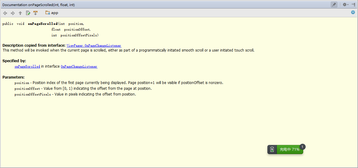 ,
,
其中,第一个参数position表示滑动到了第几页,比如说,若从第0页滑动至第一页,那么position将一直为0,直到松手以后,滑动至第一页,position将变为1,第二个参数positionOffset表示滑动的百分比,取值范围是0-1,最后一个参数positionOffsetPixels表示滑动的像素数。
下面是从0—>1页面时打印的log,如下所示:

从1—->2页面时打印的log:

从2—->1页面时打印的log:

最后,可以根据(position+positionOffset)*1/3,来设置该Indicator的marginLeft。
首先,应为Indicator设置宽度,其宽度应为屏幕宽度的1/3:
 WindowManager manager = getWindow().getWindowManager();
    Display display = manager.getDefaultDisplay();
    DisplayMetrics outMetrics = new DisplayMetrics();
    display.getMetrics(outMetrics);
    mScreenOneThird = outMetrics.widthPixels / 3;
其中int型参数mScreenOneThird 的单位是像素px。
设置到Indicator上:
LinearLayout.LayoutParams lp = (LinearLayout.LayoutParams) iv_tab_line.getLayoutParams();
    lp.width = mScreenOneThird;
    iv_tab_line.setLayoutParams(lp);
最终在onPageScrolled方法中动态改变Indicator的marginLeft属性:
@Override
      public void onPageScrolled(int position, float positionOffset, int positionOffsetPixels) {
        LinearLayout.LayoutParams lp = (LinearLayout.LayoutParams) iv_tab_line.getLayoutParams();
        lp.leftMargin = (int) ((positionOffset * mScreenOneThird) + (mScreenOneThird * position));
        iv_tab_line.setLayoutParams(lp);
可实现最终效果。
以上就是本文的全部内容,希望对大家的学习有所帮助,也希望大家多多支持PHPERZ。