Bootstrap中的图片样式
发布于 2016-01-04 06:36:58 | 1245 次阅读 | 评论: 0 | 来源: PHPERZ
这里有新鲜出炉的Bootstrap v3教程,程序狗速度看过来!
Bootstrap Web前端CSS框架
Bootstrap是Twitter推出的一个开源的用于前端开发的工具包。它由Twitter的设计师Mark Otto和Jacob Thornton合作开发,是一个CSS/HTML框架。Bootstrap提供了优雅的HTML和CSS规范,它即是由动态CSS语言Less写成。Bootstrap一经推出后颇受欢迎,一直是GitHub上的热门开源项目,包括NASA的MSNBC(微软全国广播公司)的Breaking News都使用了该项目。
1、img-rounded
<!doctype html>
<html lang="en">
<head>
<!--网站编码格式,UTF-8 国际编码,GBK或 gb2312 中文编码-->
<meta http-equiv="content-type" content="text/html;charset=utf-8" />
<meta http-equiv="X-UA-Compatible" content="IE=edge">
<meta name="Keywords" content="关键词一,关键词二">
<meta name="Description" content="网站描述内容">
<meta name="Author" content="Yvette Lau">
<meta name = "viewport" content = " width = device-width, initial-scale = 1 ">
<title>BootstrapDemo</title>
<!--css js 文件的引入-->
<link rel="stylesheet" type="text/css" href="../bootstrap-3.3.5-dist/css/bootstrap.min.css">
</head>
<body style="padding: 20px;">
<div class = "container">
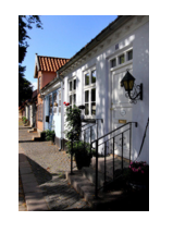
<img src = "5.jpg" class="img-rounded" >
</div>
</body>
</html>
.img-rounded{border-radius:6px;}
效果:
2、img-circle
<body style="padding: 20px;">
<div class = "container">
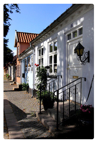
<img src = "5.jpg" class="img-circle" >
</div>
</body>
.img-circle{border-radius:50%;}
效果(因为本图片的宽高大小不同,所以呈现出椭圆,如果将width和height设置相同,那么会呈现出一个圆):
3、img-thumbnail
<body style="padding: 20px;">
<div class = "container">
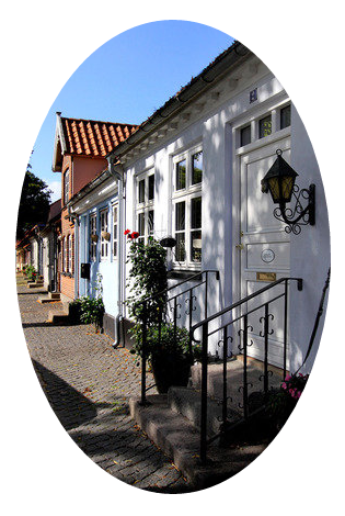
<img src = "5.jpg" class="img-thumbnail" >
<img src = "4.jpg" class="img-thumbnail" >
<img src = "3.jpg" class="img-thumbnail" >
</div>
</body>
.img-thumbnail{display:inline-block;max-width:100%;height:auto;padding:4px;line-height:1.42857143;
background-color:#FFF;border:1px solid #DDD;border-radius:4px;transition:all 0.2s ease-in-out;}
效果:
4、img-responsize
<body style="padding: 20px;">
<div class = "container" style = "width:150px;">
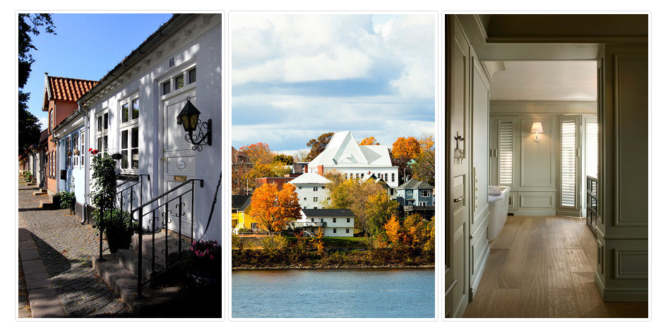
<img src = "5.jpg" class="img-responsive" width="400px" >
</div>
</body>
.img-responsive{display:block;max-width:100%;height:auto;}
效果(img中的width属性值被忽略):